Project: Jobs Dashboard
Product Designer @ Smartling, 2017-21
Jobs Dashboard, Extreme Makeover
Rebooting Jobs
![]()
Smartling use revolves around daily requests for original content to be translated, edited, reviewed and published.
It is fast paced and involves sophisticated workflow processes, with large teams and varying user permission levels, project structures, toolsets. Tracking these job requests is a critical piece of the day to day.
Discovering Deep Roots
We had an array of challenges build up over 10 years of the company existence. Due to the varied nature of permissions, needs, and wishes between customers and translators, as well as internal effects like pricing models and different APIs, to our surprise, a large number of versions of the “Jobs” page existed, handled by multiple teams with different features and only floating further and further away from one another.
There were multiple smaller attempts in the past to improve the Jobs page, however in early 2020, I had begun to work with our new Product Manager, Sophia Lazare, who had joined us from the Language Services team. Her focus on the translation agency side of the business helped to give our team attention to a part of the platform that often was run outside of the focus on our customer-centric team.
The initial goal was simply to help update the translator Jobs page—but after discussions with the tech team leads and with the CEO being brought into the conversation about the time wasted by splintered code, we had focus and support to improve problems we had all seen in portions. The mission was now to make life easier for everyone on our team as well as our user base, both customer and translators. It was time to unify the Jobs page.
Differences in Roles, Permissions and unfortunately Codebases
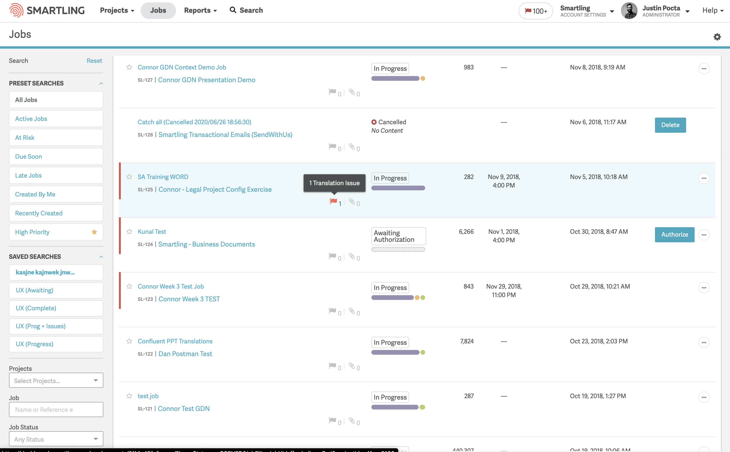
Designs I inherited had many concerns. Learning about the 7 different sets of code helped me to realize that is was not a simple problem to fix, but caused a mess of an experience for our users.
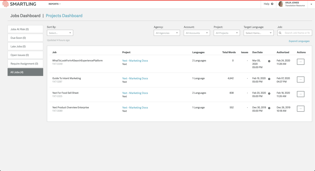
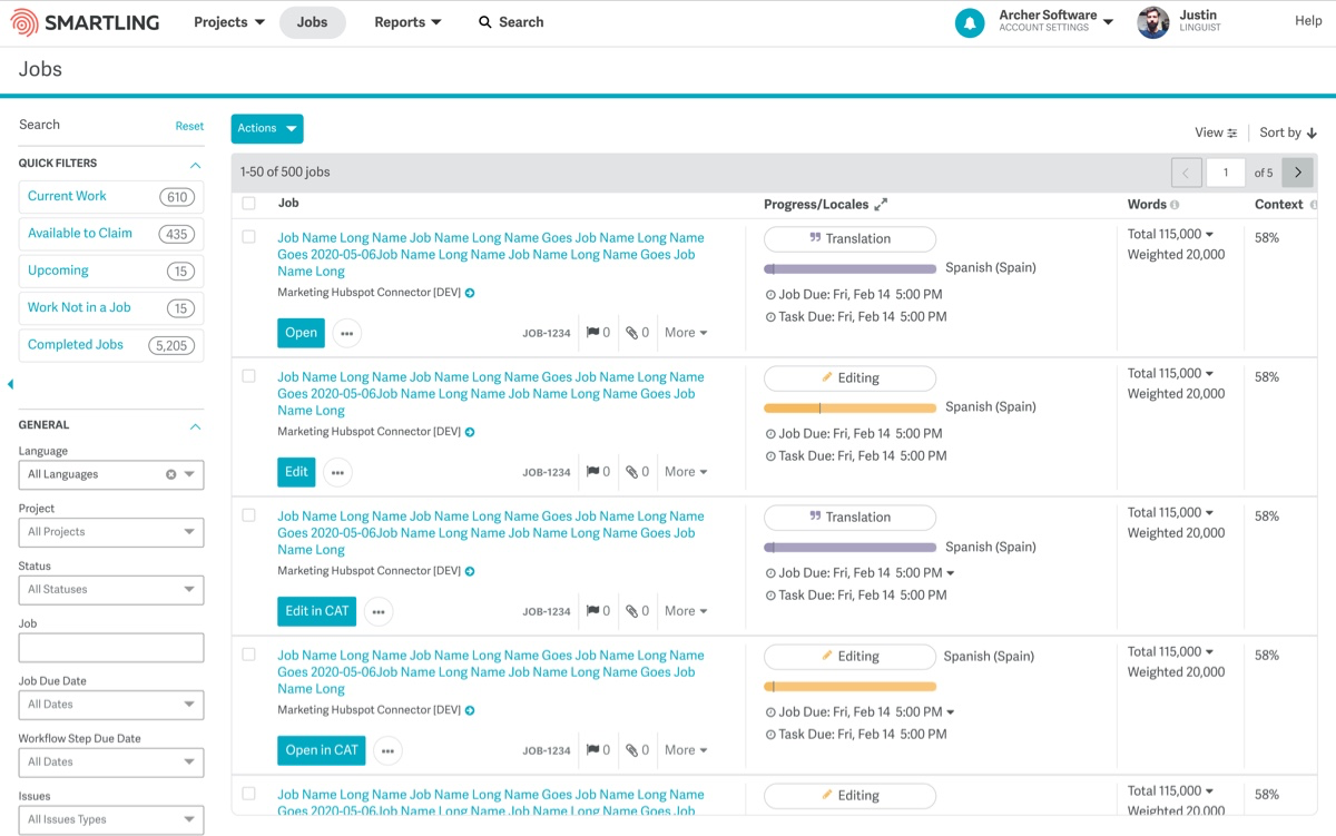
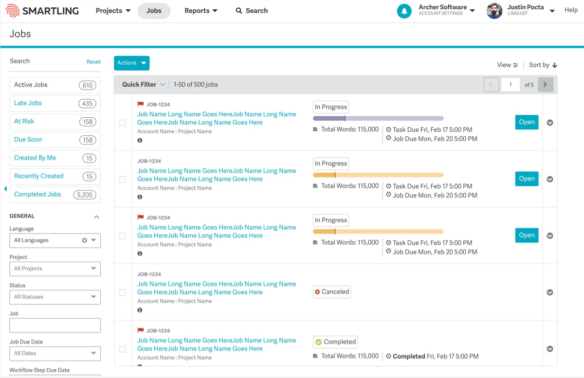
In this early screenshot before we started the project, you can observe below, basic data being displayed such as 1 or 2 Languages. A recent feature allowed visibility of the individual languages to be toggled. However, a visual status was lacking.
Another minor but important element in scanning the list—a mixture of dates were posted onto the page while one was more of a backup reference rather than an important piece of information to be emphasized.
All in all, it was barebones and lacking in consideration for the needs of a Localization Manager or Agency Owner.
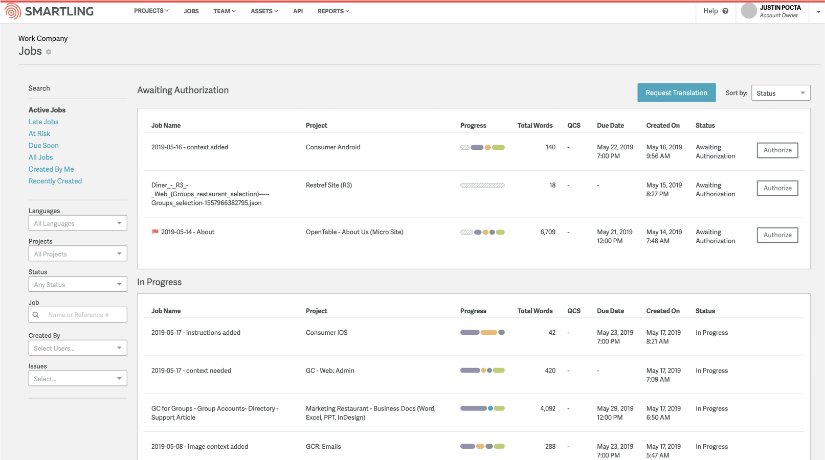
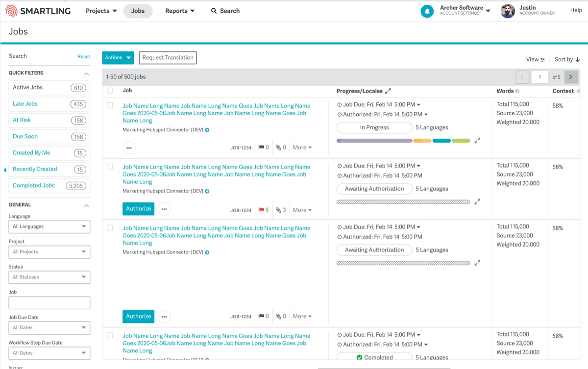
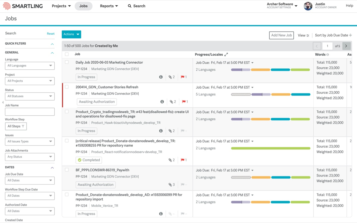
Initial Design for Customers & Translators
Listening In
Before getting too caught up in features, Sophia and I met with both translation agencies and customers. Sophia’s rapport with agencies having been on the Language Services and my focus on open conversation in user research helped us to give interviewees space to be comfortable to be brutally honest and share their frustrations, processes and needs.
We collected input that helped to shape incorrect assumptions and validate aspects we had observed but wanted to confirm. After initial conversations where we gathered insights, we began to show initial mockups. This allowed us to speak to functionality and understand what data or filters they found to be wasteful. Giving interviewees space to take part in an envisioning of their future created a space for dialogue, trust, and excitement. In some companies it might be risky to workshop ideas, but the investment our translators have in our platform makes them subject matter experts. Those are opinions we place a lot of value and were helpful in challenging us to consider any missteps we might be taking.
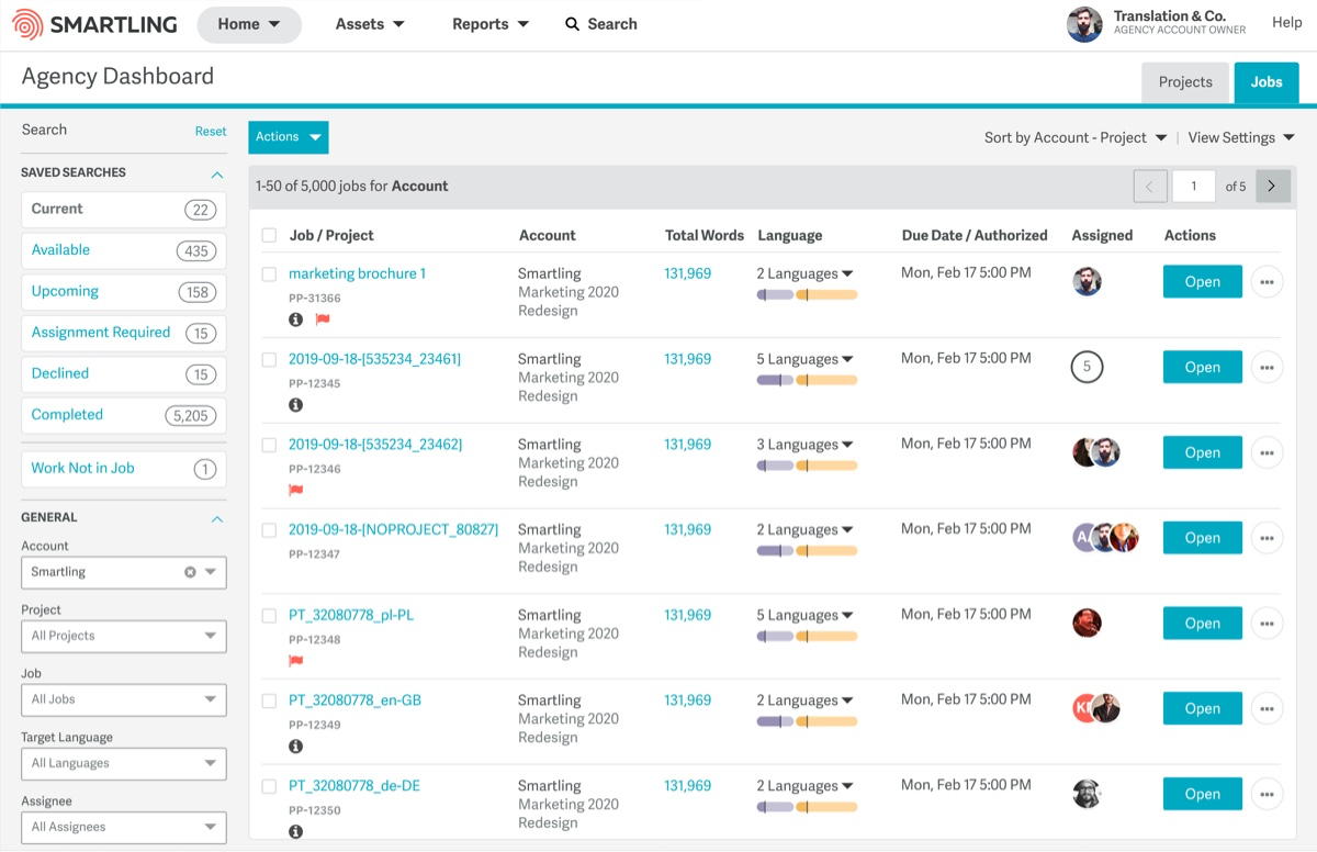
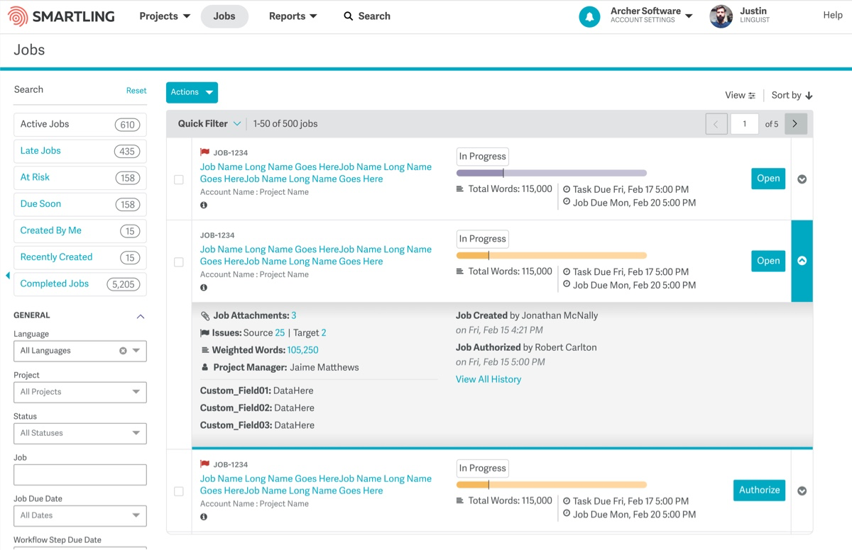
In this early iteration, we found that assignees were not valuable to users—general workflow status was critical.
Design Iterations

Data Grid vs Table
A major internal debate through the definition process had to do with what this page actually would be categorized as, what it should be. Would users want to edit data on this page like a Monday.com or would it just outline the most important data of a job and require the user to “click in” to handle it?
The user interviews definitely pushed us closer to the middle but did not point us to a total spreadsheet approach. The biggest pain we gathered from talking to our customers was clarity in status. Dynamic via filters to help reduce opening 15 browser tabs to learn about progress for a single language, but not editable. Intense daily conversations and debates amongst our team were incredibly helpful in making sure the vernacular we all used was actually describing the same concept, which led our developers down the right road for building a graphQL service to pull information in quickly and effectively and let us avoid refactors later on. I’m grateful for the dialogue and engagement our departments put into the project.
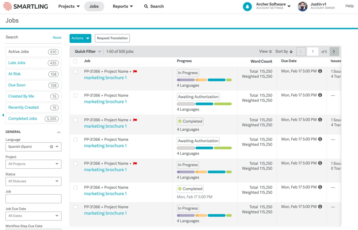
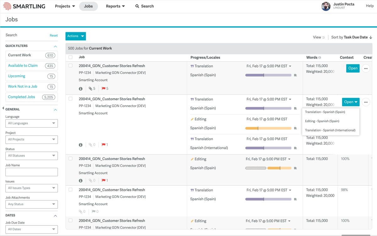
Phase 1 Launch
After getting the critical pieces in place, we launched the first iteration of the project—the major enhancement of phase 1 focused on: better filtering, dynamic data, and saved searches (which many customers were thrilled to have).
Future phases are planned to catch up the code to the UX vision where we intend to implement features like: custom column visibility, horizontal scrolling, and bulk selection to allow actions like assignment/unassignment to be incredibly fast and to save our localization managers hours in their week.
Project Notes
Details
WEBSITE
Timeline
- DISCOVERY TO DEV HANDOFF
- Jan 2020—August 2020
The Team
Product/Design
- Sophia Lazare (PM)
- Justin Pocta (UX/UI)
Development
- Jeremy Shankle, Dmitry Masley, Oleksandr Tymchenko, Pavlo Myrotiuk, Valerii Linetskyi, Sergey Chichulin, Yurii Beiko, Xiaoyun Yang, Rich Tam, and our summer intern Dominic DeMarco alongside multiple BE teams to get all the pieces converged and working smoothly.