OpenGov Projects
Senior Product Designer, Budgeting - 2021-22
A collection of UX work at OpenGov
Balancing the Budget App
![]()
I took on the opportunity to join OpenGov as Sr. Product Designer for the Budgeting and Planning team in May 2021 on a UX team of 12 who were managing 4 apps across the platform.
During my time there, I supported the engineering and product teams launch work from other designers as I was onboarded, partnered with our UX Researcher and CSM team to interview customers, designed projects alongside Product Manager, and collaborated with the Engineering and QA team to review, refine, and help get projects out the door.
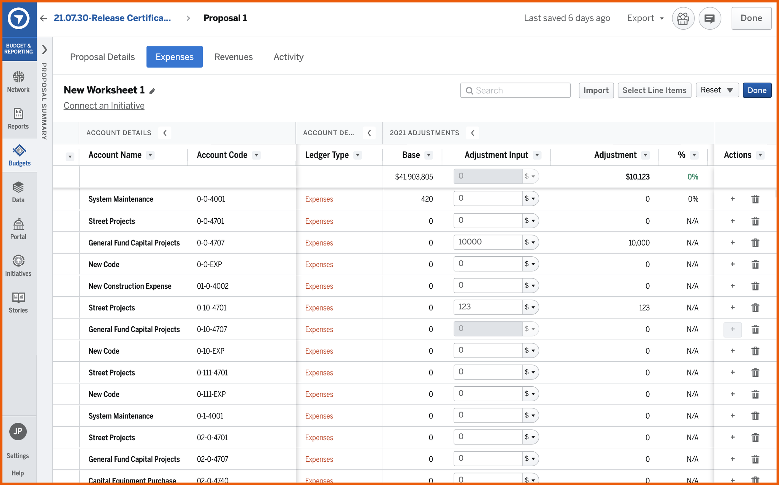
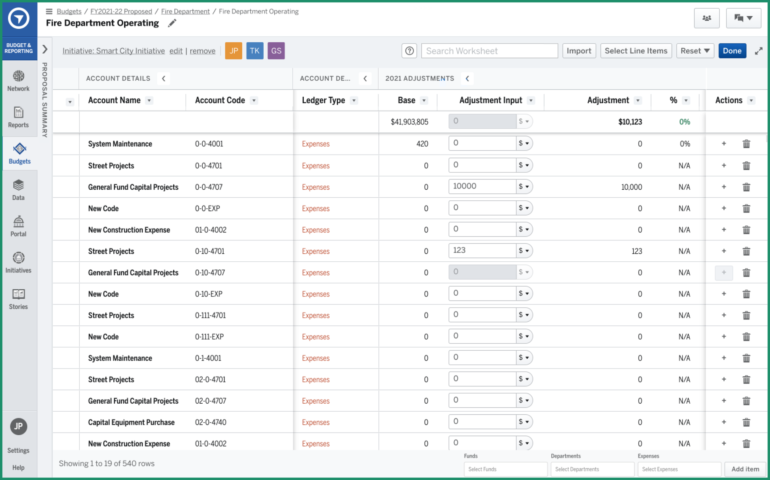
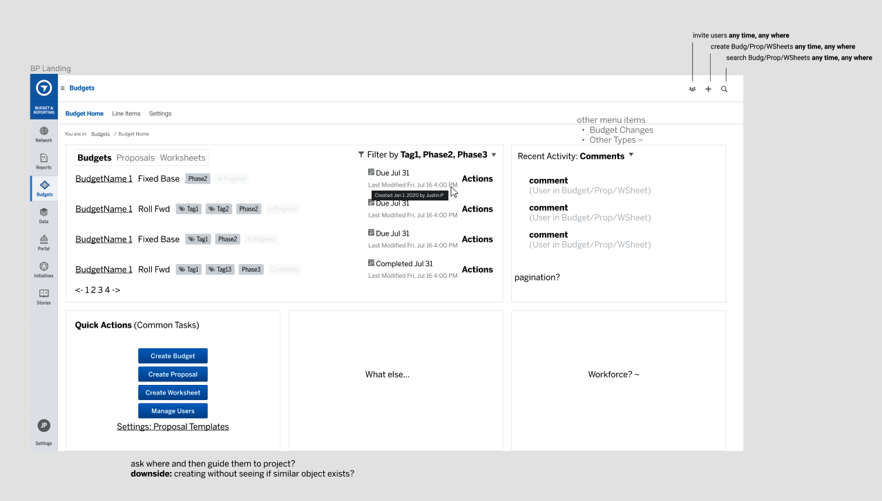
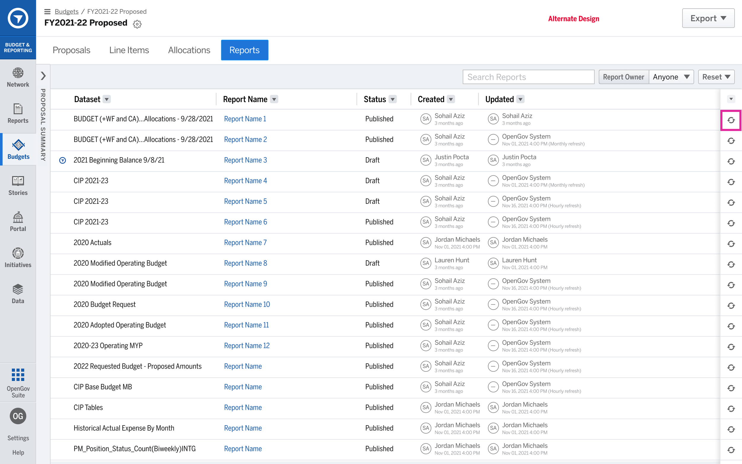
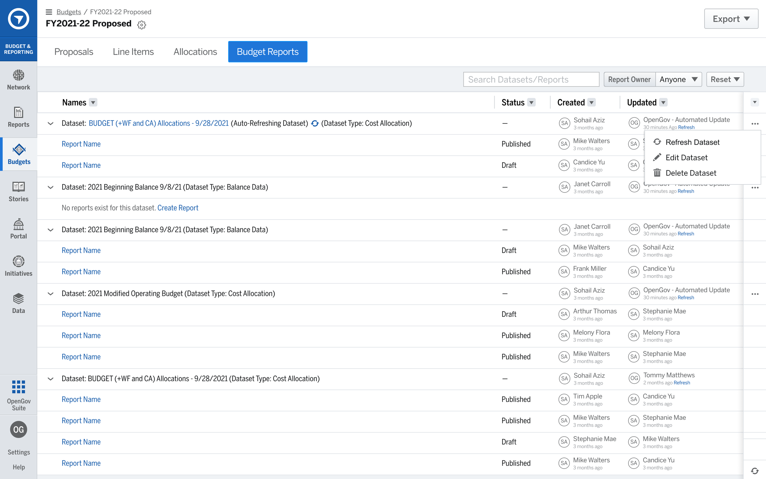
Project: Wayfinding Clarification
Problem Statement & Kickoff
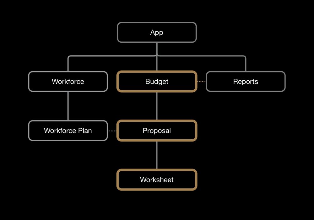
Goal: Improve clarity of a user’s current location in the app and the app infrastructure overall
Based on feedback from users, navigational issues were a clear struggle for users. Onboarding as a new user to a platform is a perfect time to see things as others do and a critical time to make notes about it, before you get “used to” the quirks and can explain why things are the way they are. People using an app don’t care about explanations. They just want to be able to do what they want to do—without feeling lost or frustrated.
Wayfinding is cumbersome
- It is difficult to move up a level in the site structure
- It can be confusing to know where you are
- Users may enter a page from other locations or bookmarks
- Some users would miss an icon that opened the menu to load a different budget
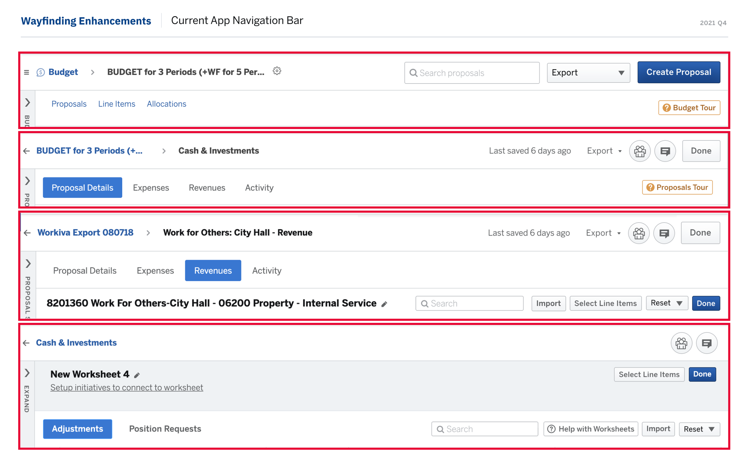
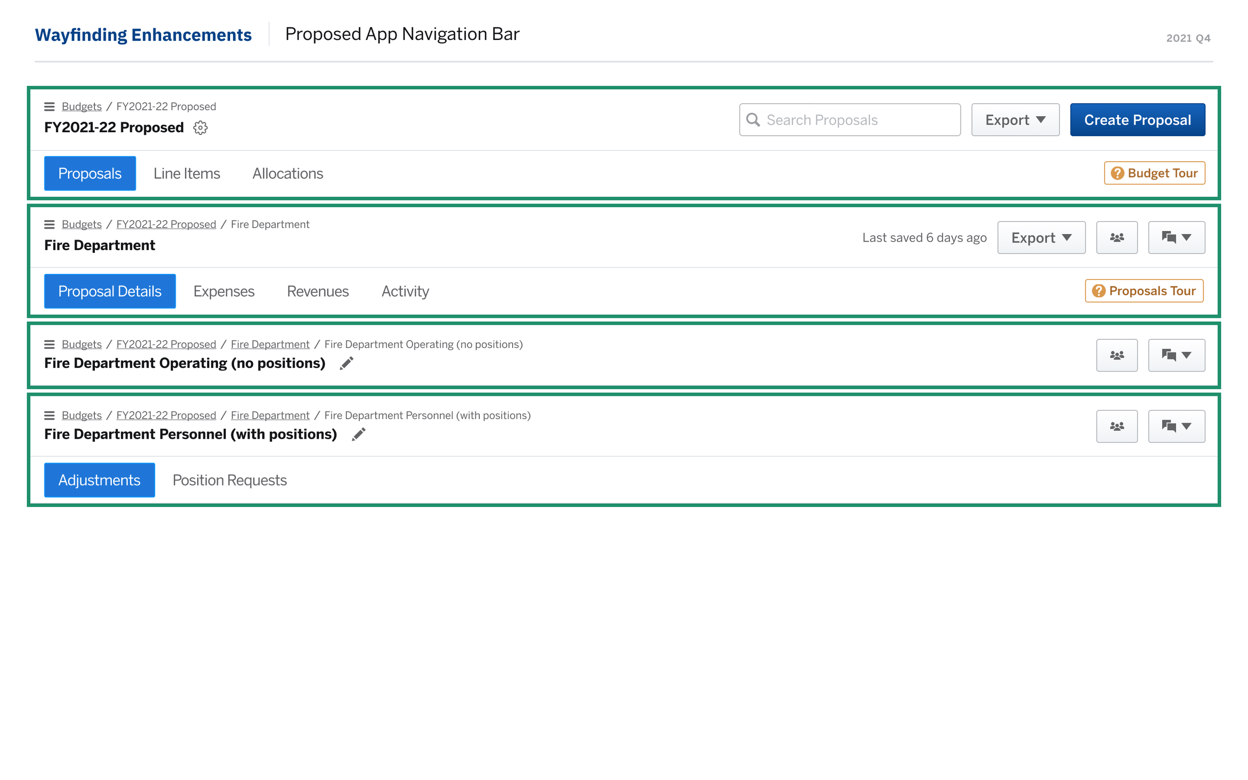
A comparison of the varying levels of the app emphasized inconsistency, IA details missing at times, and lack of clarity about where you will be taken upon clicking a back arrow or other button, such as “Done”.
Research & Design Process
-
As stated, I had been compiling notes I pieced together learning the platform and capturing concerns and confusion I experienced. I had screenshots, comments, and questions I was still searching to answers.
-
I began meeting with internal stakeholders to interview them about comments heard from users.
-
I reviewed existing research insights from the Lead UX Research, as well as investigating user feedback that had been captured in the CRM.
Results & Lessons
The project was still in development when I left, but it set the stage for a reusable pattern that could be componentized by the team to avoid the scenario we worked to undo of a mismatch of structure across different teams.
Similar to Google Sheets and other spreadsheet tools, we gave users a more focused view that focused on a single worksheet and more consistent behavior in the header / navigation structure.
If I did it all over again,
I would have talked to developers earlier to uncover some of the code duplication I found later on.
I would have interviewed more people to collect more insights
Future Plans: I was investigating were to develop a landing page where users could be led deeper into the site without having to click into each level. I also intended to merge Worksheet pages together - the two types, Expenses and Revenues, were separated and created more clicks, removed the naming could call to users, and reduce hunting around for their worksheets. Visual Graphs were one of our blockers and we needed to redevelop that code first to avoid unnecessary reworking of these pages.
Designs: Before & After
(VERY ROUGH) BONUS SKETCHES: EARLY EXPLORATIONS / BLUE SKY IDEATION Early on, I met with a lot of internal teammates to see what concepts were sticky based on rough approaches I based off of my early experiences of the platform. Looking at broad strokes of opportunities and beginning to strategize a vision without worrying about how soon we could pull it off. The project, as you have seen was fairly targeted and reduced to navigational elements, but how these could line up with a future vision was important to explore since I was taking a lot of information in.
I find that creating collaborative, interactive space can help stir up dialogue and trigger commentary as well as specific scenarios from colleagues who meets regularly with customers. Since they all had a longer tenure at the company than myself, I was hoping to gather from them intel and general themes about customer feedback.
I would not use these conversations as validation for shipping, but rather to give me some gut feedback from people who know the platform. It helps to feel out the prioritization and sensibility as they take in the ideas I have and work through them about how something could be applied or if it just doesn’t speak to what they’ve seen.
These concepts were really enjoyable to talk through with members of the team because it created lots of energy and idea generation, as well as creates a space for building relationships and trust between departments by giving them my ear, bringing them in on initial stages of UX processes, and creating a partnership. All of this is definitely the type of thing that makes me love work in the field of UX.
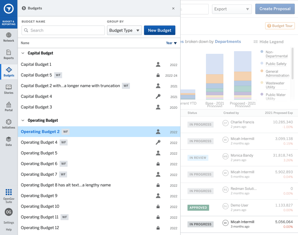
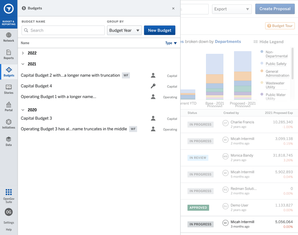
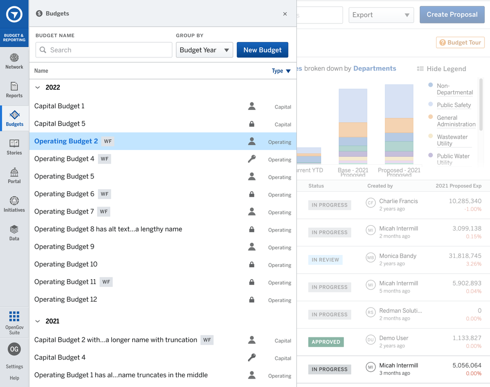
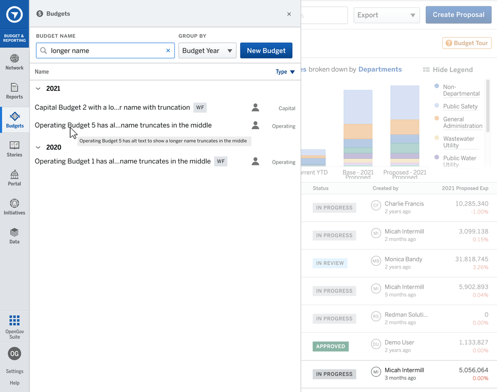
Project: Budget Organization
Project Goal & Kickoff
The initial direction were told was to “simply add folders” to allow users to organize their budgets due to the Budgets list being a confusing and problematic part of the site. Upon partnering with the product manager, we gathered more data to validate this request, as something felt off about it based on what we saw across many customer accounts.
Early discussions with the developers made us aware that it would be a cheaper and faster approach to build upon our existing menu instead of creating a new landing page. We had a vision for a new landing page which required more time and research, so saving time now while still making improvements was a valuable quick win.
The initial design only told users what the Budget Year was, lacked any sorting control or even communication over how the current sorting worked.
Research & Design Process
Working with one of our developers, we pulled data about what customers’ budgets looked like, we found only a few accounts had more than 20 budgets.
My PM and I hypothesized that “folders” for organization was simply a feature request trying to solve an deeper issue: lacking control of the list of budgets and missing information.
I designed a variety of approaches to consider how we might be able to enhance the controls and experience. By collecting important data points from internal stakeholders as well as investigating the naming conventions of the budgets, we had a clearer picture of the mental models users had about their budget structure. We found users dropping in a lot of the metadata our list wasn’t provided to them in the menu, as we expected. With this information, we were able to discuss with our developers the designs and find out what was readily available to our list.
My goal was to keep the existing design to maintain a smaller scope of work, while working toward ways of displaying useful information without overwhelming the narrow space. This led me to create two methods of sorting, where I could group by the main categories we already had—in a way, creating a folder but without any user interaction. And by moving this information up a tier, it minimized the data we displayed in the columns. Iconography also proved useful to represent 3 important states of a budget: Editable, Locked, or Admin-Only Access. This meant less text but clearer presentation than where we started.
Results & Lessons
Ran an in-app feedback survey to a targeted group of users. Received 88% positive feedback from the 9 replies. This also gave us additional feedback and requests that we could follow up on to continue enhancing this experience for our customers.
Where we landed was not that different, but it added control and clarity. This is what we were hearing from users.
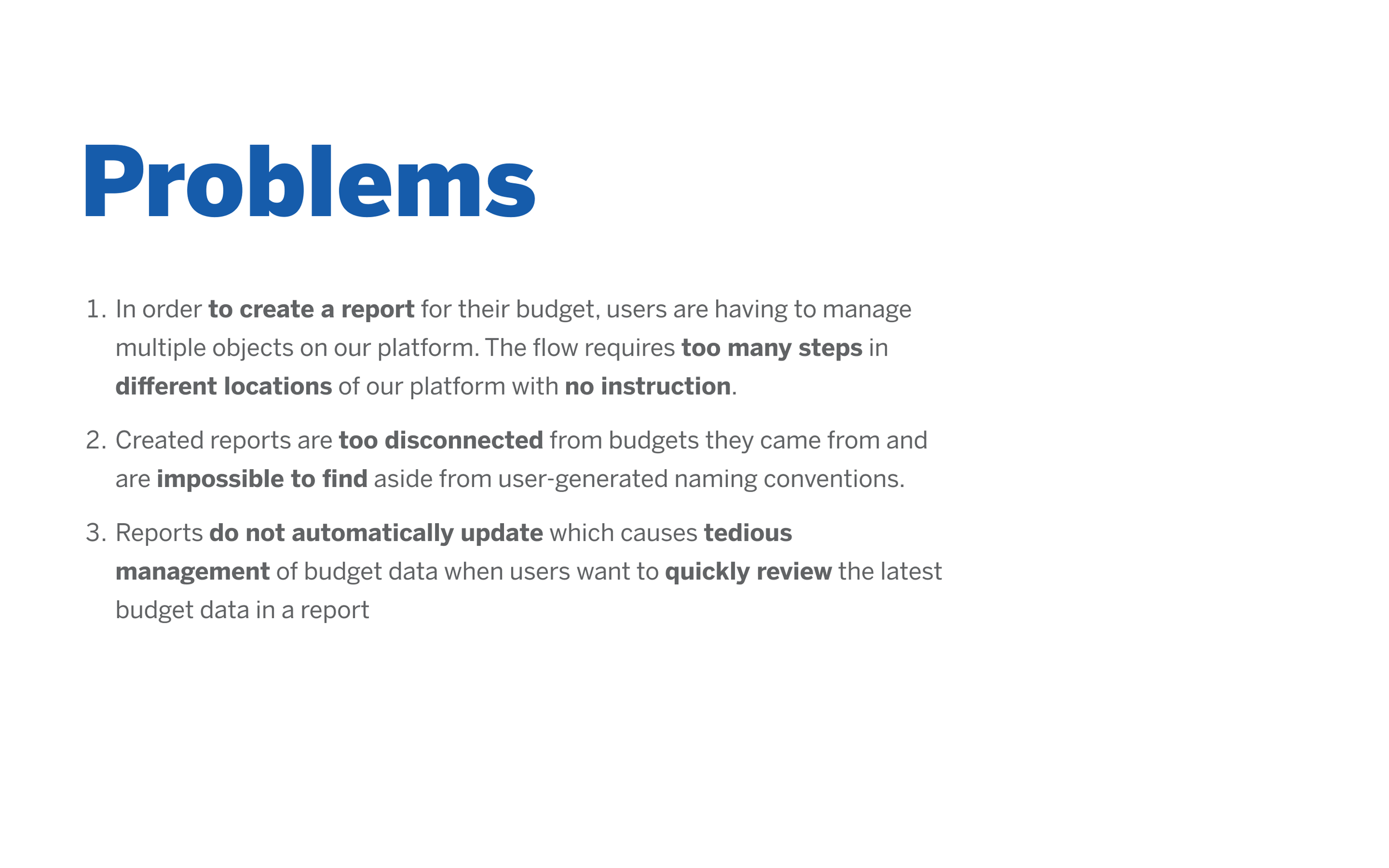
Project: Improving Reports Customer Journey
Project Goal & Kickoff
Our team had identified a challenging user flow which I had heard many times myself from internal interviews with our customer-oriented subject matter experts. Creating and finding “Reports” was difficult. It was also owned by another team, so we needed to connect and collaborate on how things worked and what we could do.
From the Budget team side, the design and product members met to consider aspects that we were able to control and improve. As multiple members, including myself, were newer, we searched documents and also met with developers and engineering architect to dig up history and understand how certain concepts were created. Knowing the past was helpful for our understanding of why these structures existed. Being able to cast a vision for the future is easier when I have a sense of how we got to “now”.
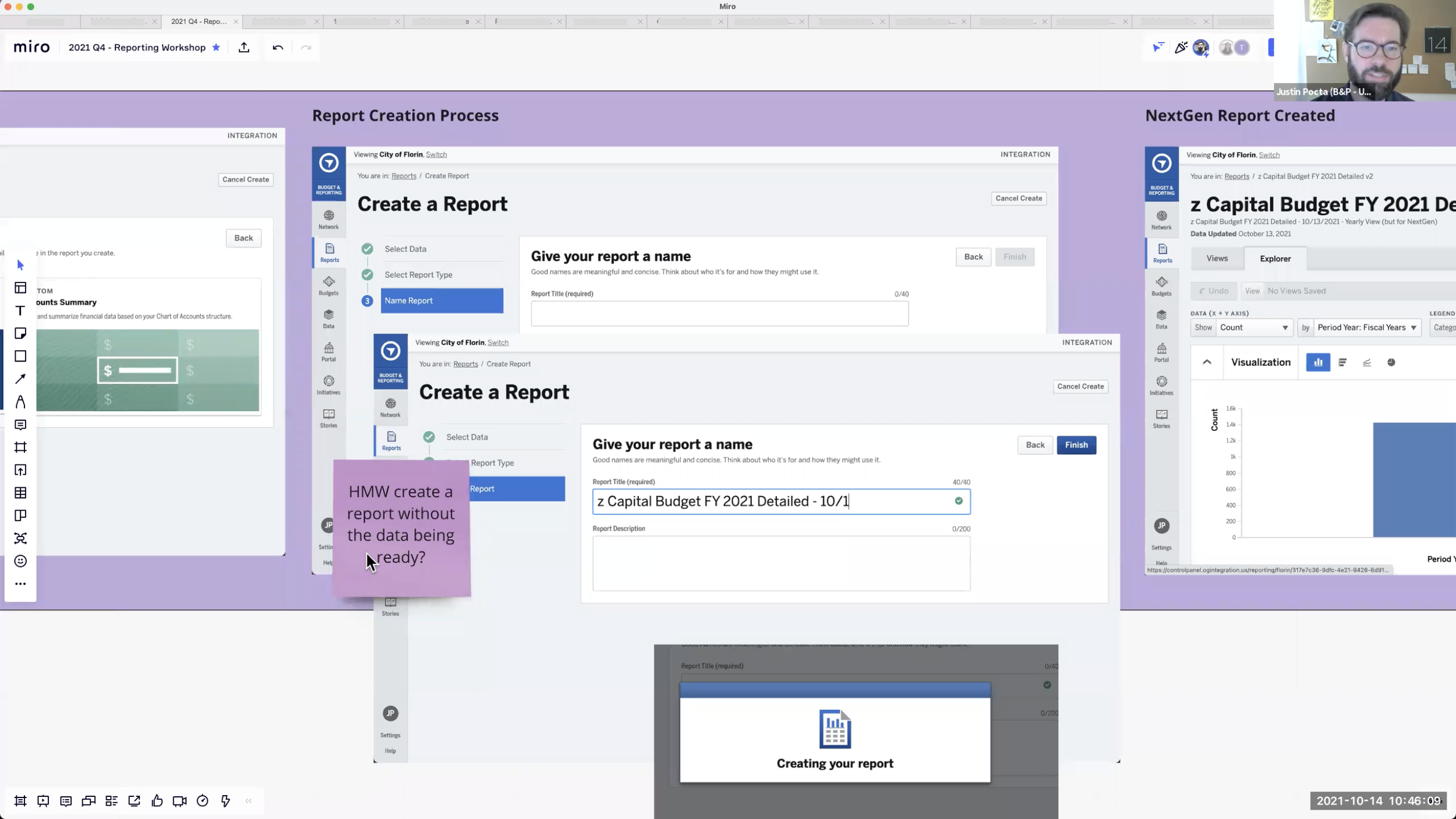
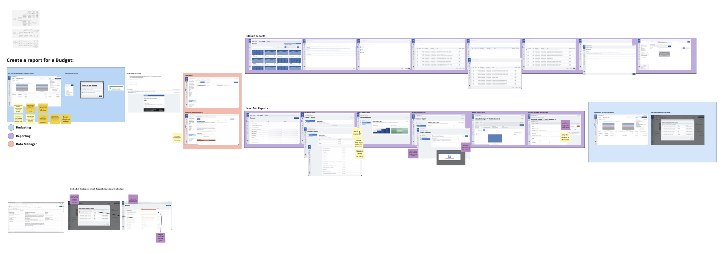
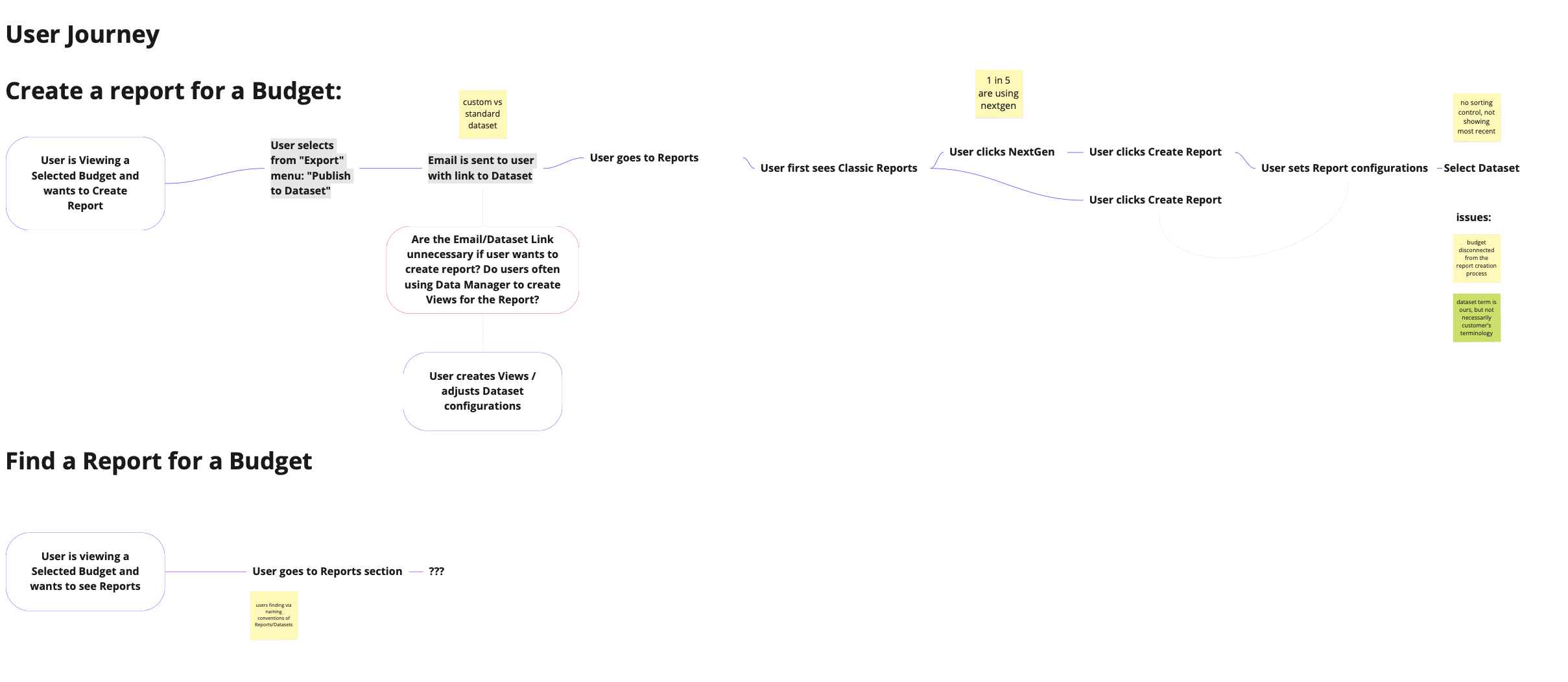
Workshop
Reviewing Miro whiteboard to understand user process flows and generating ideas with the design and product teams
Research & Design Process
Although I was generating initial designs which I added below on how to improve the experience, I led a workshop with Budgeting and Reporting teams to share information, align, and dream up some possibilities.
To help save time in the Workshop, I created a visual step-by-step flow of everything a user needs to do to create a Report as well as calling out issues throughout the journey. Some of the team was likely very aware, but because we were talking about multiple apps I wanted to make sure we all saw the full picture.
Additionally, I brought in existing user feedback so we could be aware of those insights and refer to them as well to keep in motion.
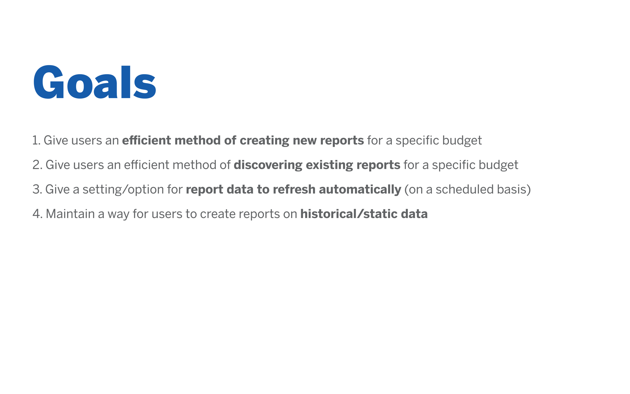
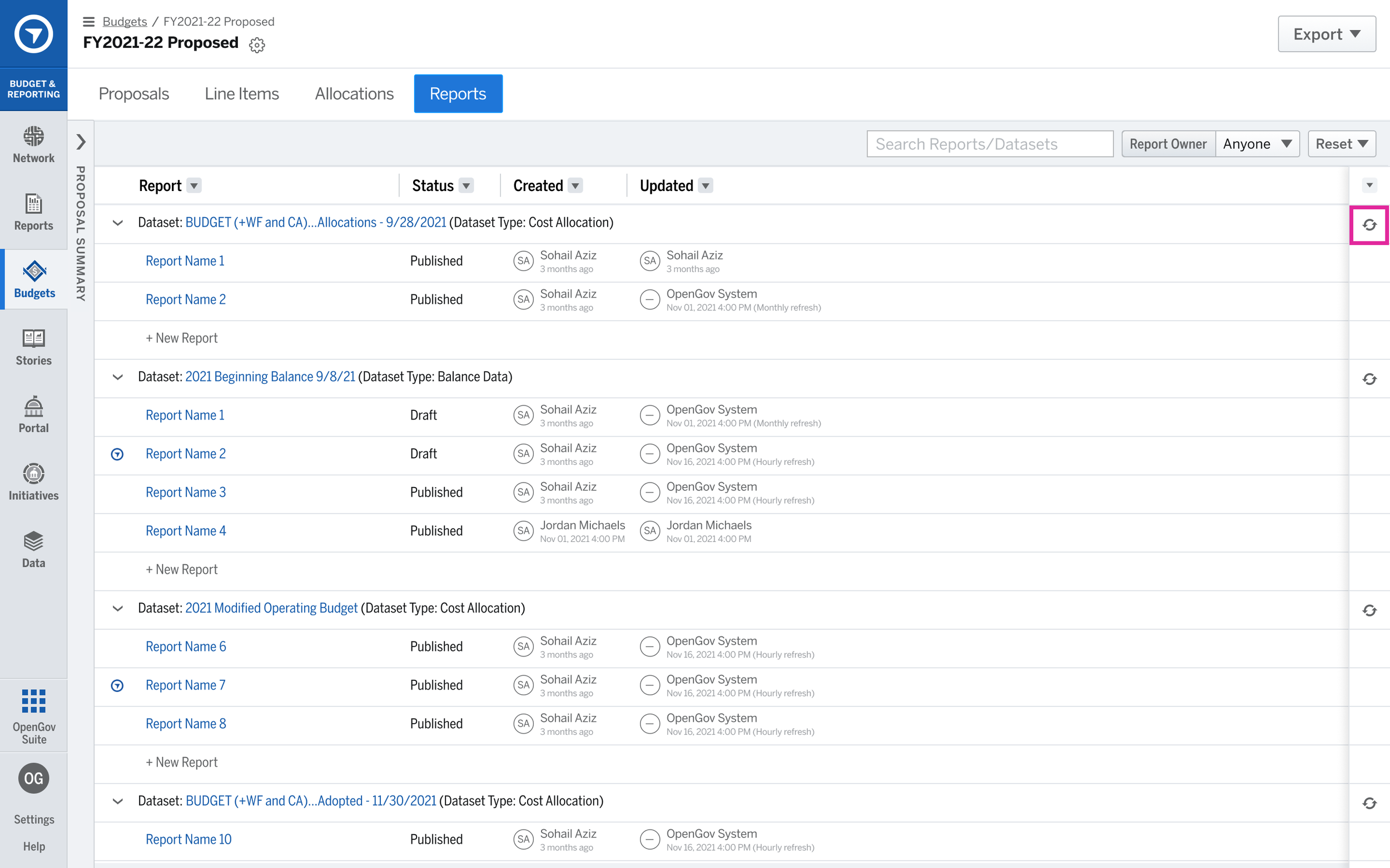
After the workshop, I continued meeting with Product as well as Engineering Architect to dive deeper into some of the blockers we had and to determine if there were any roles I could play from Budget Team’s UX side. Below is the Initial Approach we landed on was to quickly release a way of viewing Reports from a Budget. We learned enough from other teams to discover we could pull this off easily enough while we continued to investigate the long term solution of even faster workflows for creating, editing, and finding reports around the system.
Results Workshop: It was a useful experience and starting place for both teams to partake in. Generating new ideas and hearing from multiple perspectives—design, product from differing positions in the platform.
We have a variety of ways to reach beyond what we were doing and consider a future strategy to aim toward.
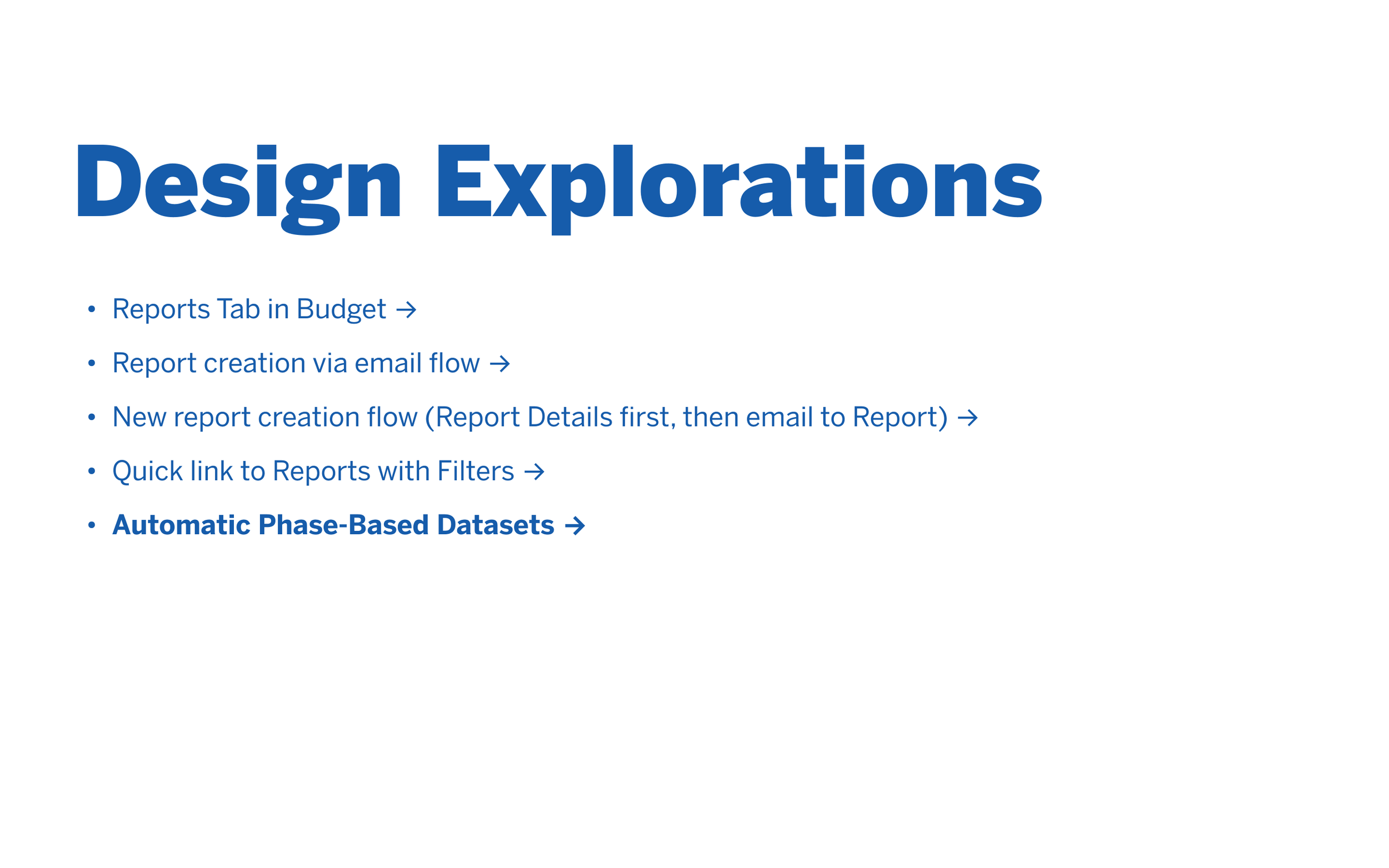
EXPLORATIONS & ITERATIONS Explorations where I aimed to reduce the user journey by creating more guidance and connecting the dots on behalf of the user instead of them hunting around the site with no trail to follow. Some of these ideas included reforming the email we send to be about Report Creation (as a way to work quickly even though their leaving the system is less ideal), refining the language we use to be focused on the creation of a Report rather than the dataset which drives the report, skipping the dataset creation for the user completely (while running it in the background) and leading to the new report instead. The challenge with some of these items is that they would involve other teams, so we could not immediately get to them, but the partnership being formed between the teams was valuable in heading the platform in that direction in regards to this specific problem.
Thanks for reading!
Project Notes
Details
Website
Timeline
- 2021 Q3-Q4
The Team
Product/Design
- Richard Baker (VP of UX)
- Justin Pocta (UX/UI)
- Lalitha Balasubramhanya (Sr. Director of Product Management)
- Christine Liu (Product Manager)
- Kim Henry (Lead UX Researcher)
Development
- Dale (FE Lead of App Frame)
- Wei Huang (Sr. Engineering Manager)
- Honestly, most of the engineering team helped fill in a lot of information and gave great guidance who weren’t necessarily on the projects I was designing.
Tools
- Pendo.io for Data Analytics/Dashboard of Reports, creating In-App Walk-thru Guides for users, and generating messages to collect Feedback and Survey Data
- ProductBoard/Trello for Project Management + JIRA and Confluence
- Google Slides for presentations
- Figma for Design and Prototyping
- Miro for Workshop Whiteboards
- Loom for sharing updates async
- Zoom and Figma for User Interviews and Usability Tests