Project: Workflows 2.0
Product Designer @ Smartling, 2017-21
Workflows 2.0
From basic linear processes into a transformed, automated dynamic translation workflow to fit real world needs of our sophisticated customers
![]()
From the beginning of my time at Smartling in late 2017, the team had a goal of refining the existing product, as well as going deeper by applying modern technologies such as powerful automations to allow our customers increase efficiency and reduce clicks. Our Workflows configuration was a prime feature to invest in this type of effect.
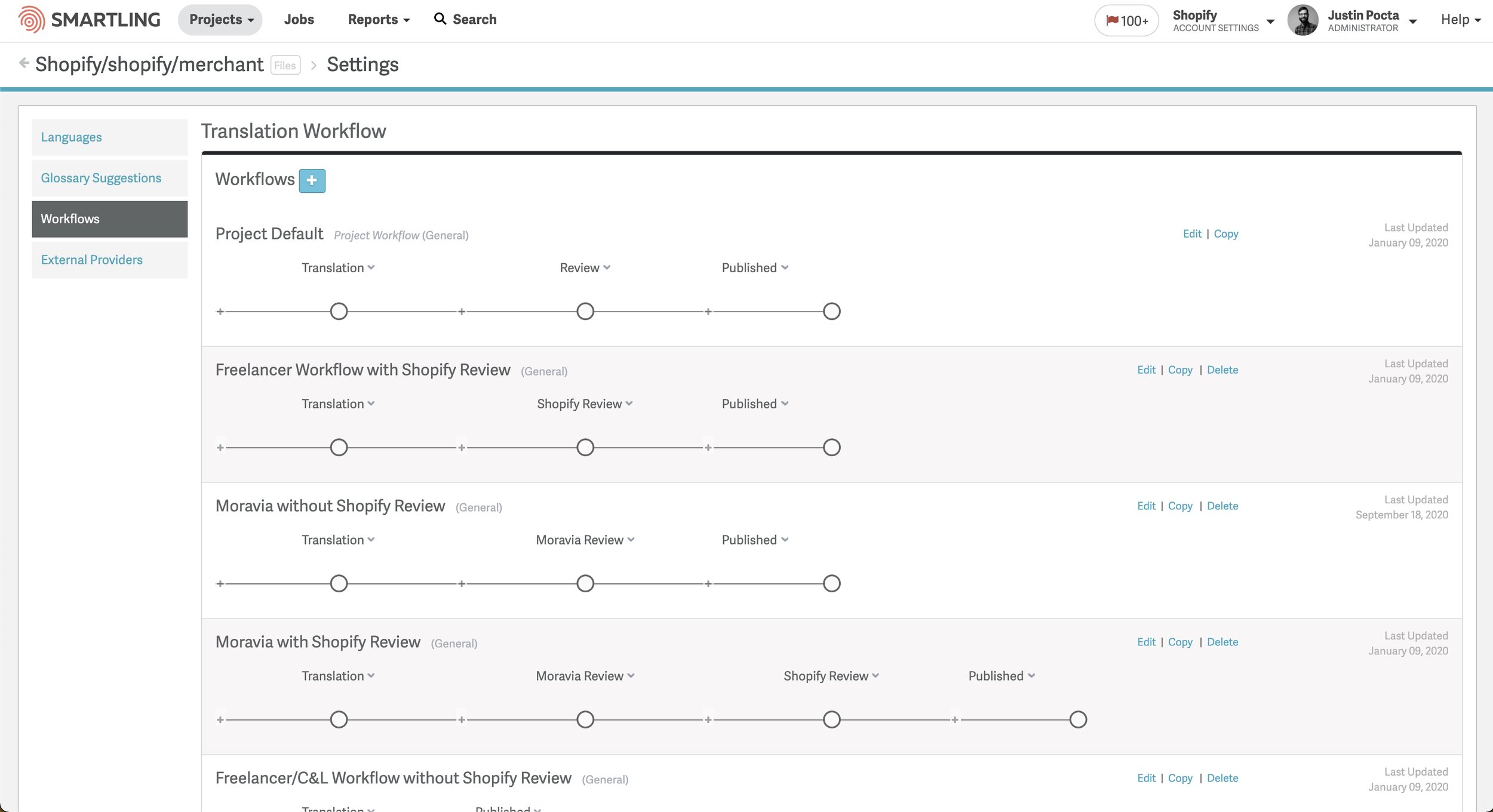
The Initial, Linear Flow
Due to localization teams maturing, customer’s departments expanding into multiple CMS integrations, and most importantly Machine Translation becoming a cheaper option for translating basic content, our simple workflow structure was no longer as effective for our customer’s needs.
Enter the “Dynamic Workflow”.
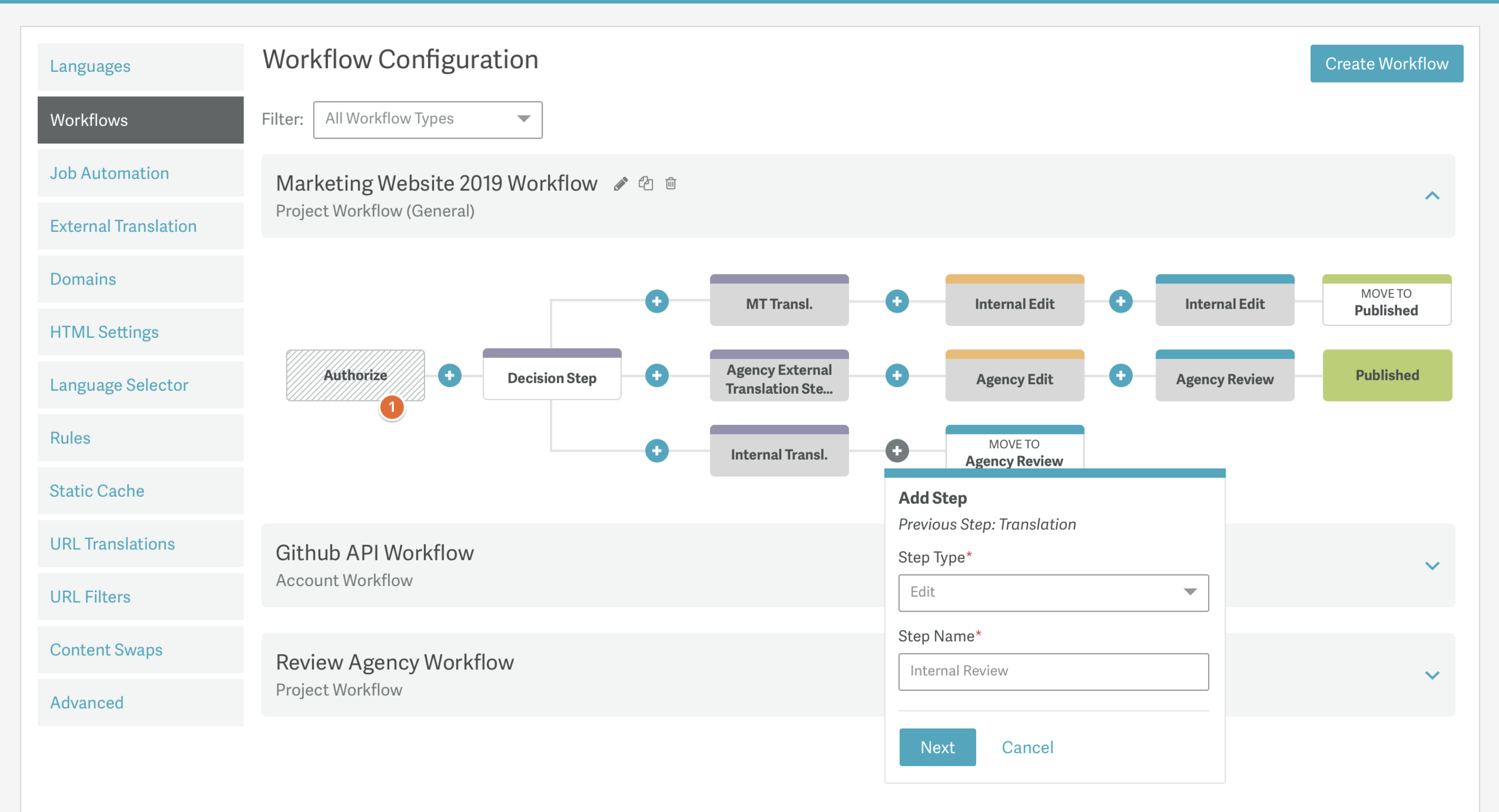
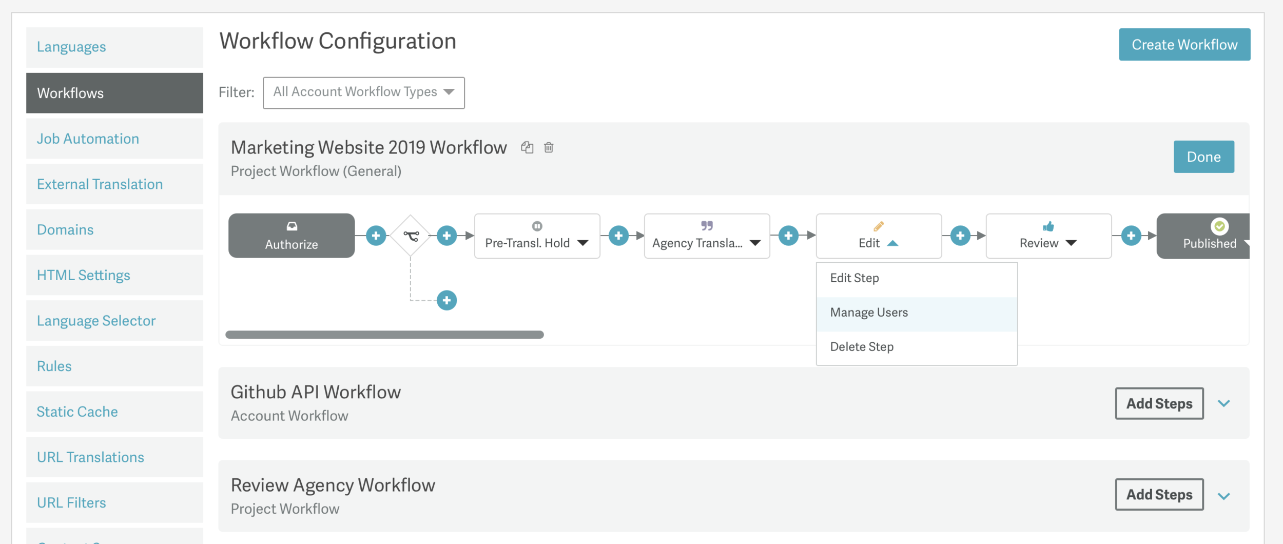
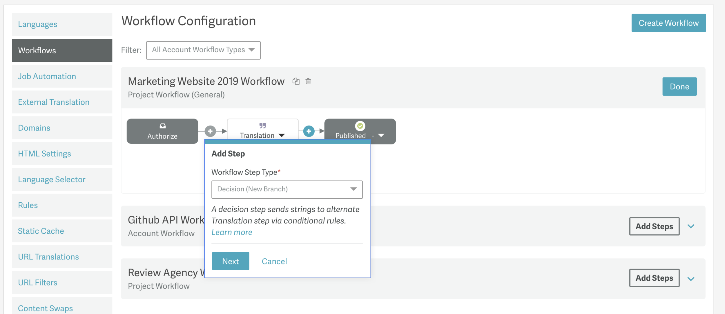
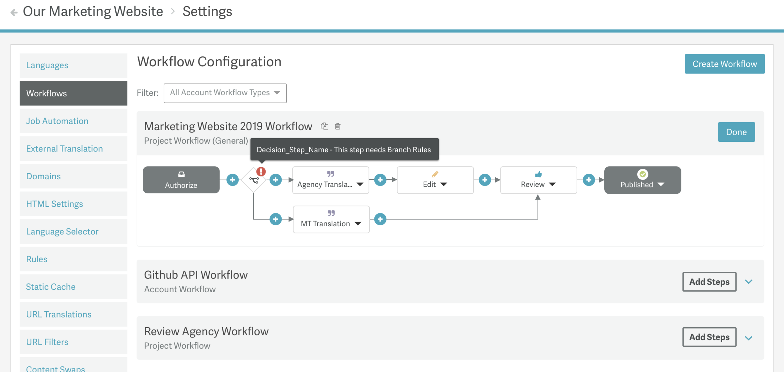
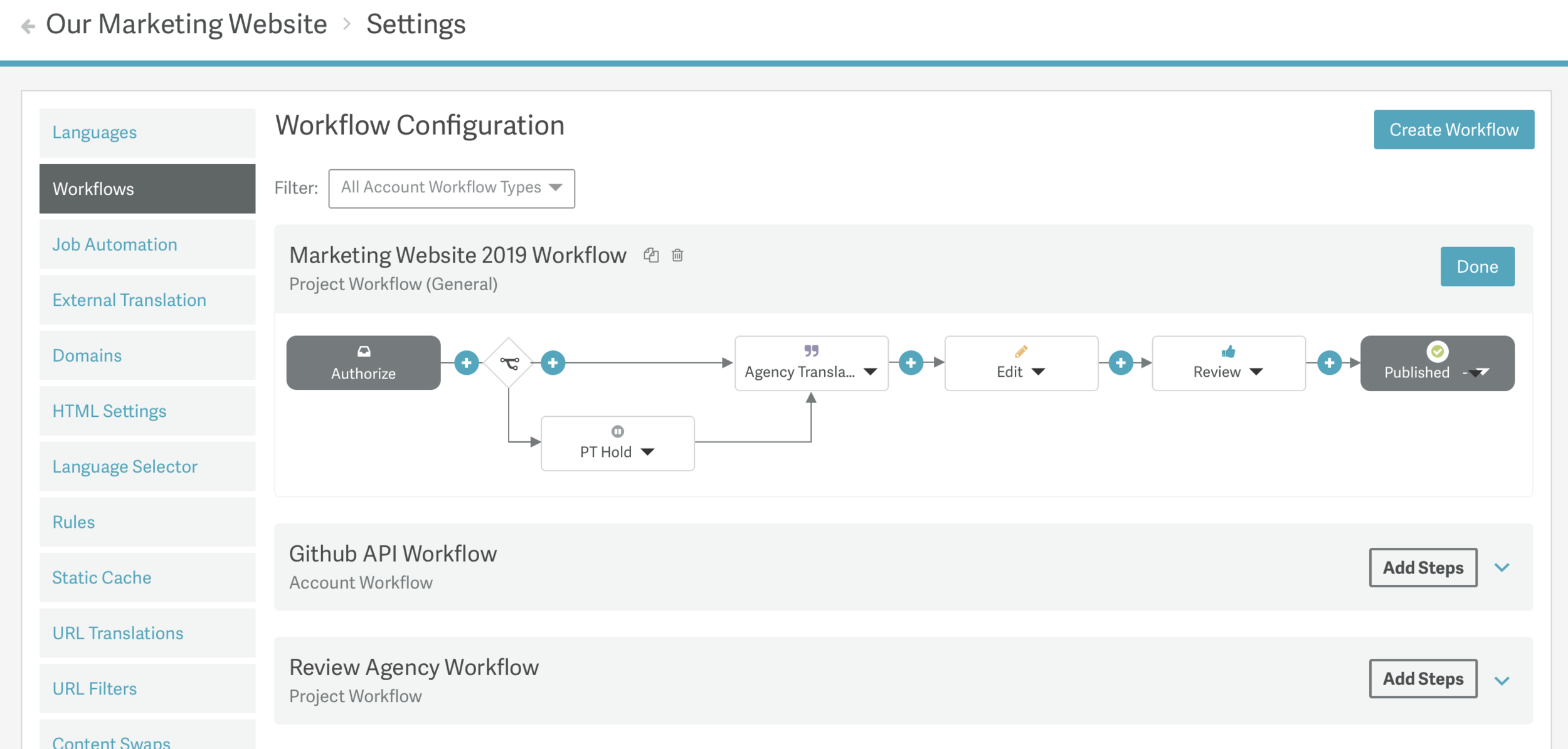
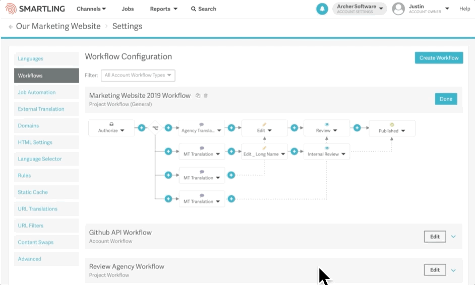
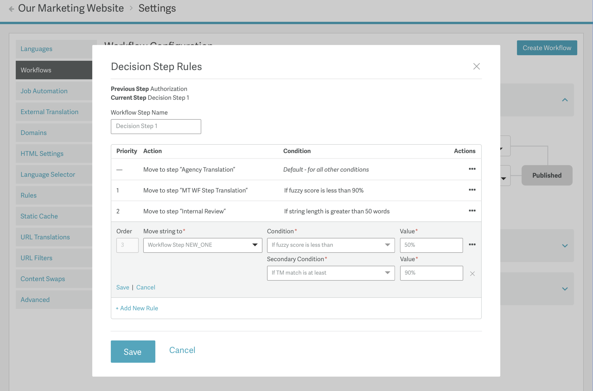
Working alongside Franco Parico, our PM for Workflows and MT tools, we kicked off a more sophisticated rules-based enhancement to our platform. Franco had gathered MVP insights by connecting closely with a major customer with a need for a better Workflow configuration. Building on top of the general existing setup, we aimed to help create an additional layer by adding a step type, the Decision Step, to help trigger alternate translation methods for the initial stage of the project. And using LaunchDarkly, we could test the impact and investigate any unexpected concerns before releasing it to all customers.
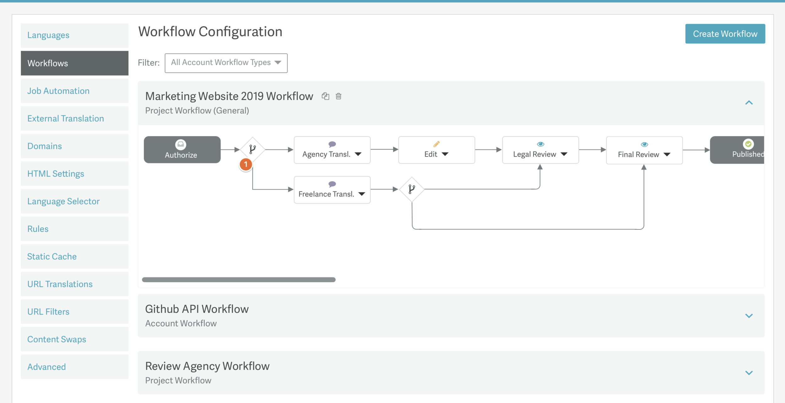
The Prior Design
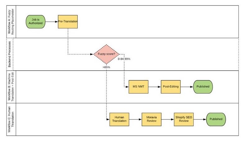
initial outline of a flow based on early customer discussions with PM
Explorations of UI and Design Frameworks
Discussions with the tech and product stakeholders helped us to assess potential tools and UI we could use. 3D Gamified visuals were noted, but discarded upon review as the goal of clear and quick UI was critical to the flow due to the list of workflows that a user would need to skim through and difficult to discover text at 45º angles was not optimal.
A set of rough mockup to consider vertical alignment (problematic for finding the default flow from the alternate pathways), persistent step creation buttons (too cluttered), and other UI explorations to find the right look and feel for such a new approach to our platform.
AWS 3D reference
Quick IxD investigations
Iterating on interactions to clarify potential flows, we explored ways to help emphasize how a multi-path flow would actually work. We adapted quickly through collaboration and reviews with stakeholders and team leads to understand what we could achieve with given constraints and MVP goals. Although the idea below did get ditched, its goal of providing routing clarity did push us to continue to seek our ways to reduce confusion for our users, which included a careful balance of truncating custom names while visualizing workflow structures without scaling down the data that mattered too much for it to be understandable.
Clarifying Categories Further
![]()
An element of our process was recognizing that the growing array of Workflow Steps called for easy identification of what each Step truly meant, particularly alongside the introduction of the rules-based “Decision Step”.
We got into iconography exploration to help our customers quickly browse Workflow Steps throughout their multiple Workflows, and also considered it as a place we could begin to better connect areas of the site together to create a common vernacular using icons with our existing Workflow Step color coding we had introduced months prior to indicate both Job progress status in the context of Workflow Step location.
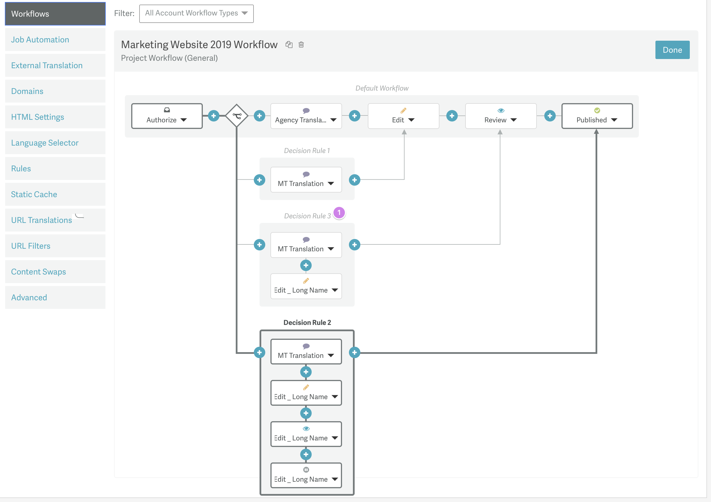
In the younger days of our design system, we began to step into the development of a new component. We recognized a need for a dynamic table which had view and edit states and the ability to insert new data. One of the major challenges we continued to run into was our limitation of components and having to work through the needs of each project as we discovered what our platform was yet missing on the fly. The UI needed to emphasize these tables as being special containers, separate from other content in a given space, in a clean and consistent way.
For Dynamic Workflows, it was critical that we give users a quick way to digest what was happening in the set of automation rules and to dive into one at a time to make adjustments as necessary without too much UI clutter of form fields. This table design spread rapidly through the side as this solutions championed the needs of our users.
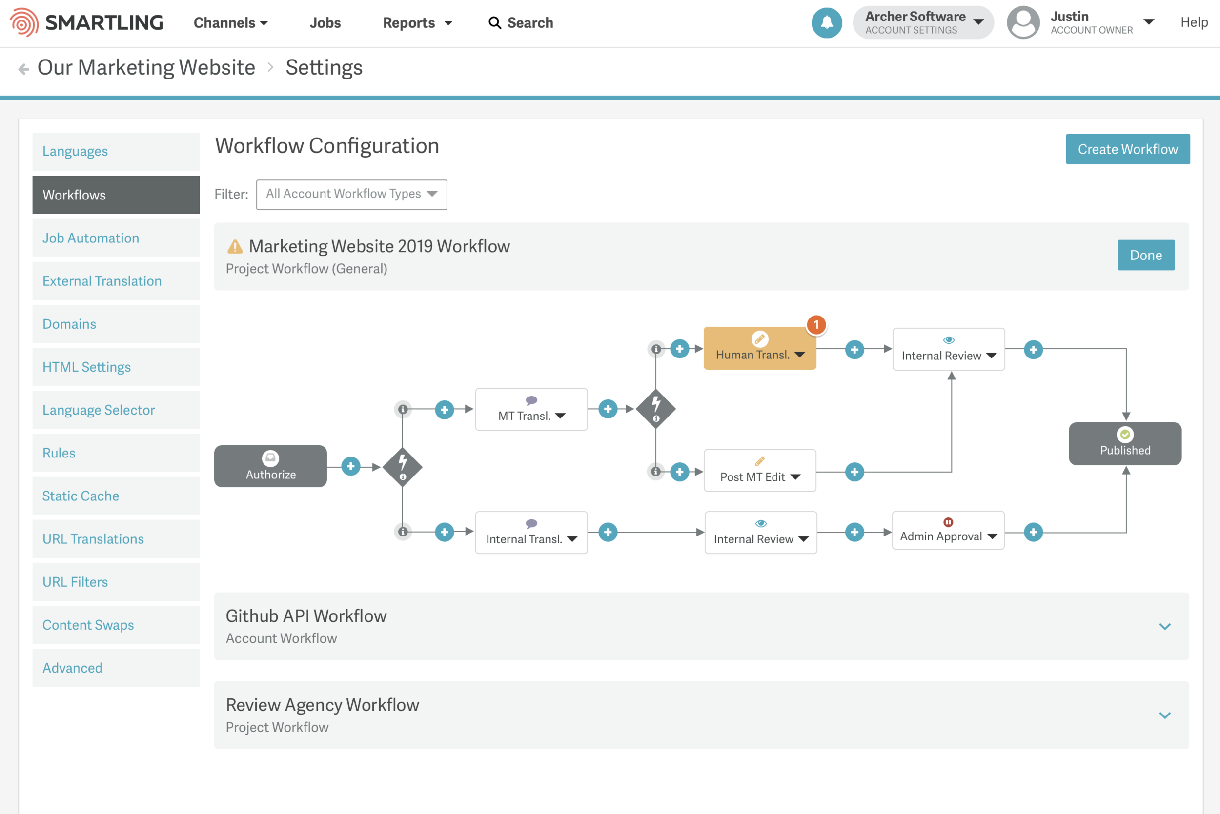
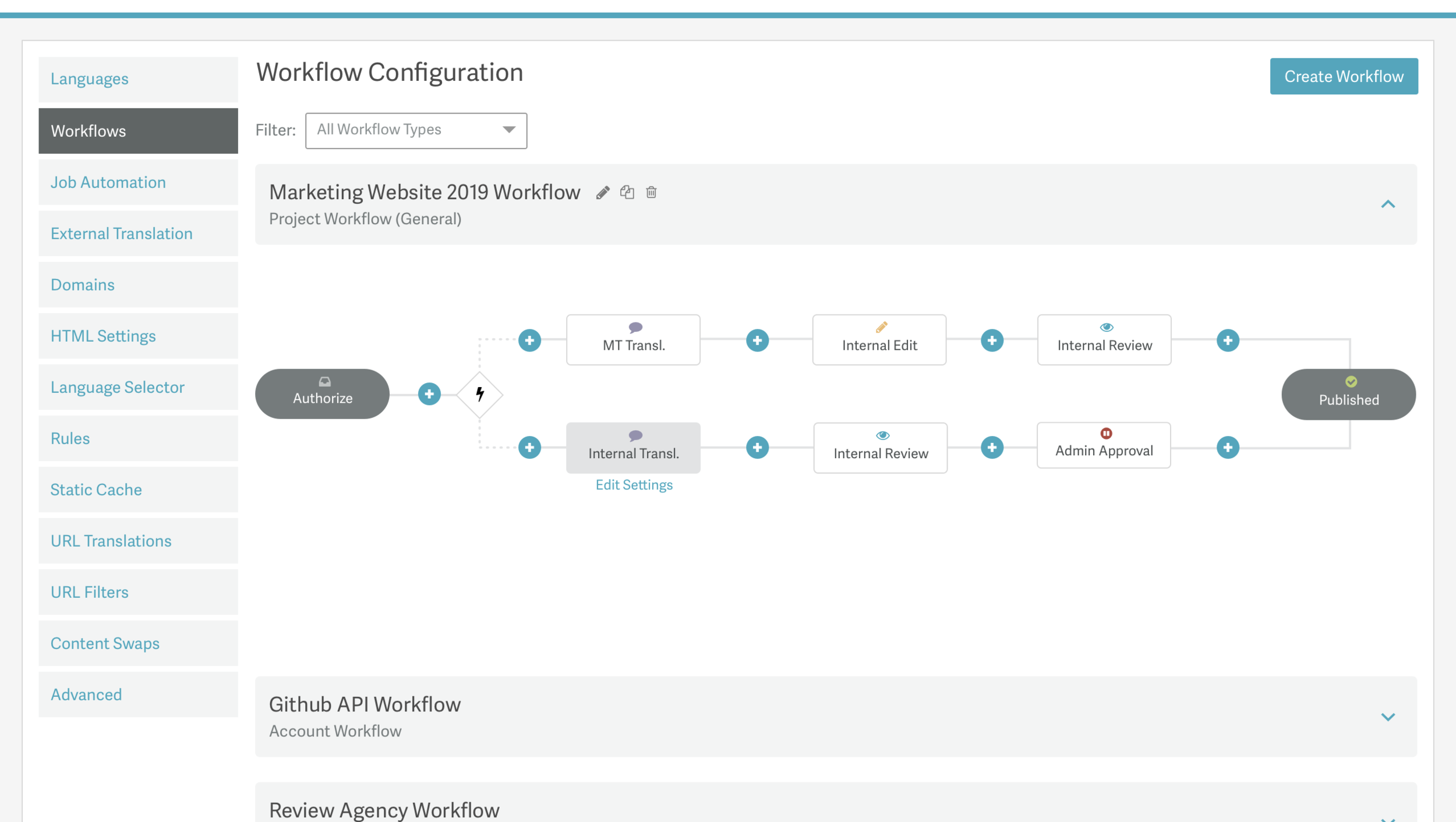
In the end, we were able to launch a workflow that allowed for a single Decision Step (with a future goal of allowing a second Decision Step to occur post-translation for edit/review steps). Our approach kept it simple enough to be quick to launch. The FE engineer partnered with us on the project launched an open source flowchart generator based on the work and helped us develop a technical solution to avoid pathways getting crossed over so that the code could be simpler.
Where we landed was thanks to the help of Product, Engineering and UX collaborating and leaning into one another’s strengths to develop a clean, clever, and non-obtrusive experience that met customer needs in terms of flexibility, due to the multitude of process frameworks various departments and company types will need on a weekly basis, as well as clarity so that account owners can create a flow and others on the team can interpret what is going on. This advancement not only helps to automate hours of work but also can help reduce the workflow duplications our customers were making for minor variations—now they can handle so much more using a rules-based, automated flow and focus their attention on more nuanced challenges.
The Final Results
Creating Decision Steps in the Workflow
Managing Rules for Decision Steps
Project Notes
Details
Website
Timeline
- Kickoff to Dev Handoff
- Jan 2019—Apr 2019
The Team
Product/Design
- Franco Parico (PM)
- Justin Pocta (UX/UI)
Development
- Xiaoyun Yang (FE - MVP)
- Oleksandr Tymchenko (FE - 1.0+)
- Ben Loy (BE)
- Dmitry Bochorishvili (BE)